Melida
Counselling.
Calm design. Clear navigation.
Web design and development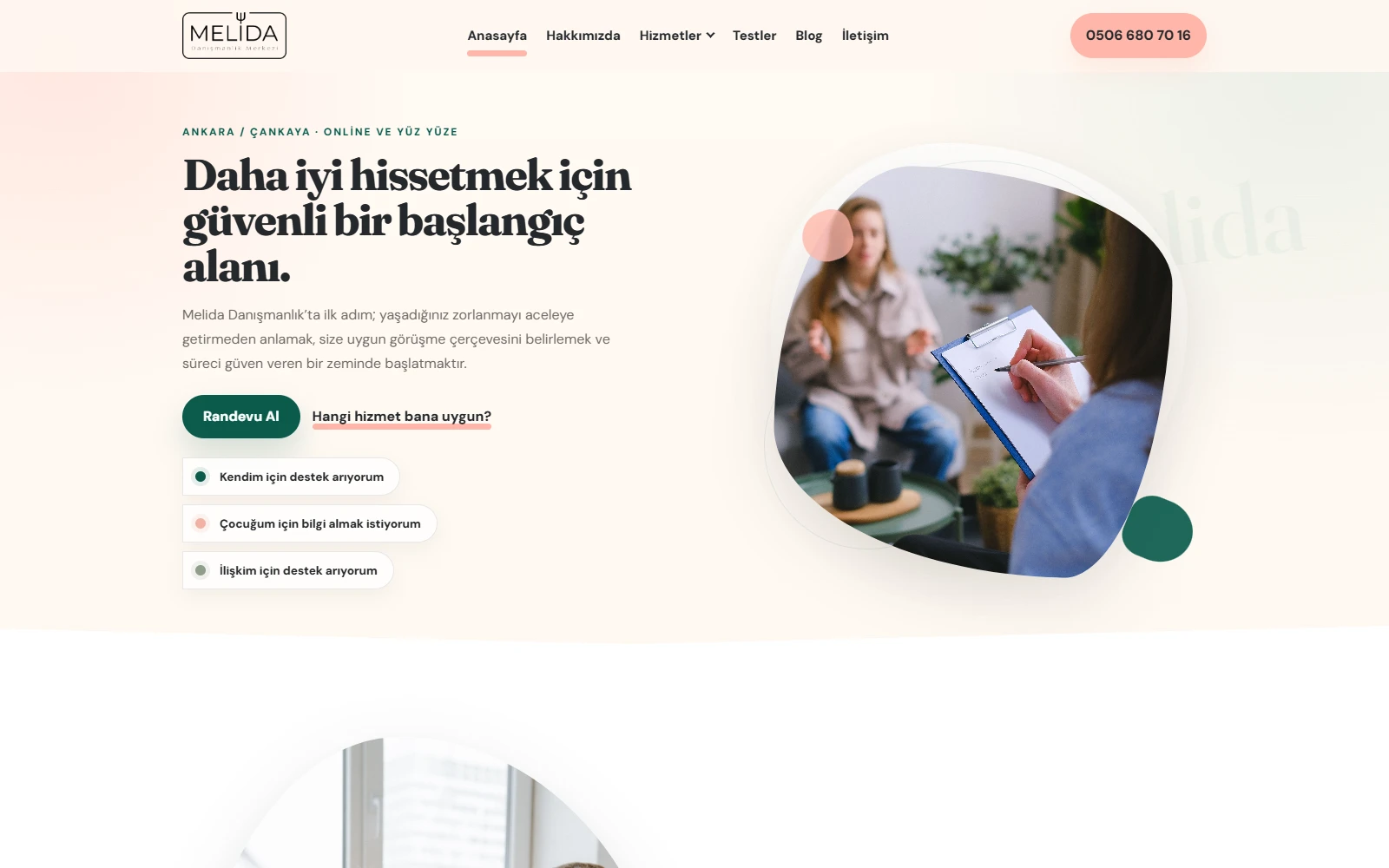
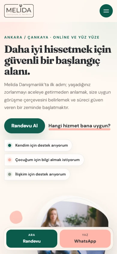
We made finding information
and taking the first step
easier.
We designed and developed a website for Melida Danışmanlık that brings services, specialists and appointment options together in a clear structure.
We used calm colours, a clear typographic hierarchy and soft visual shapes, focusing on helping visitors find the right page and get in touch.
We turned content into a guide.
We built a consistent page structure that takes visitors from the homepage to detailed service information.
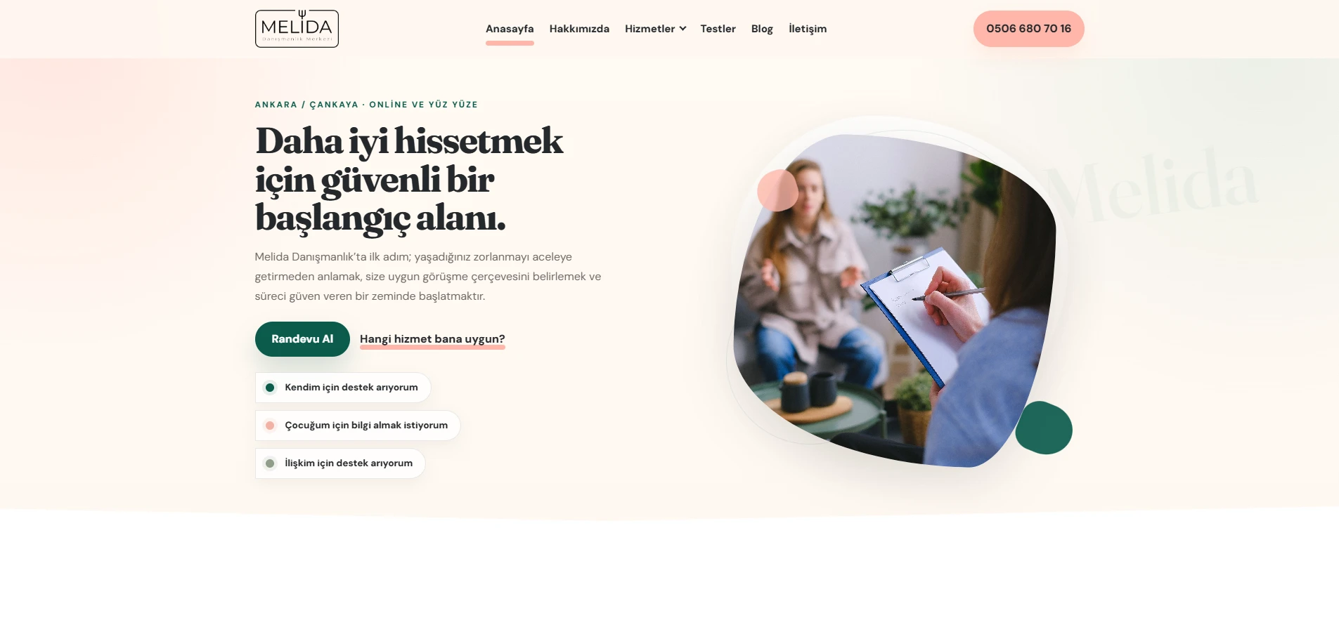
We made service selection clear.
We organised individual, couples, family, child, parenting, adolescent and corporate counselling in a service guide, linking each category to its detailed page.
We structured detailed content.
We divided service information into sections with topic headings, in-page navigation and FAQs. Tests and assessments have their own information page.
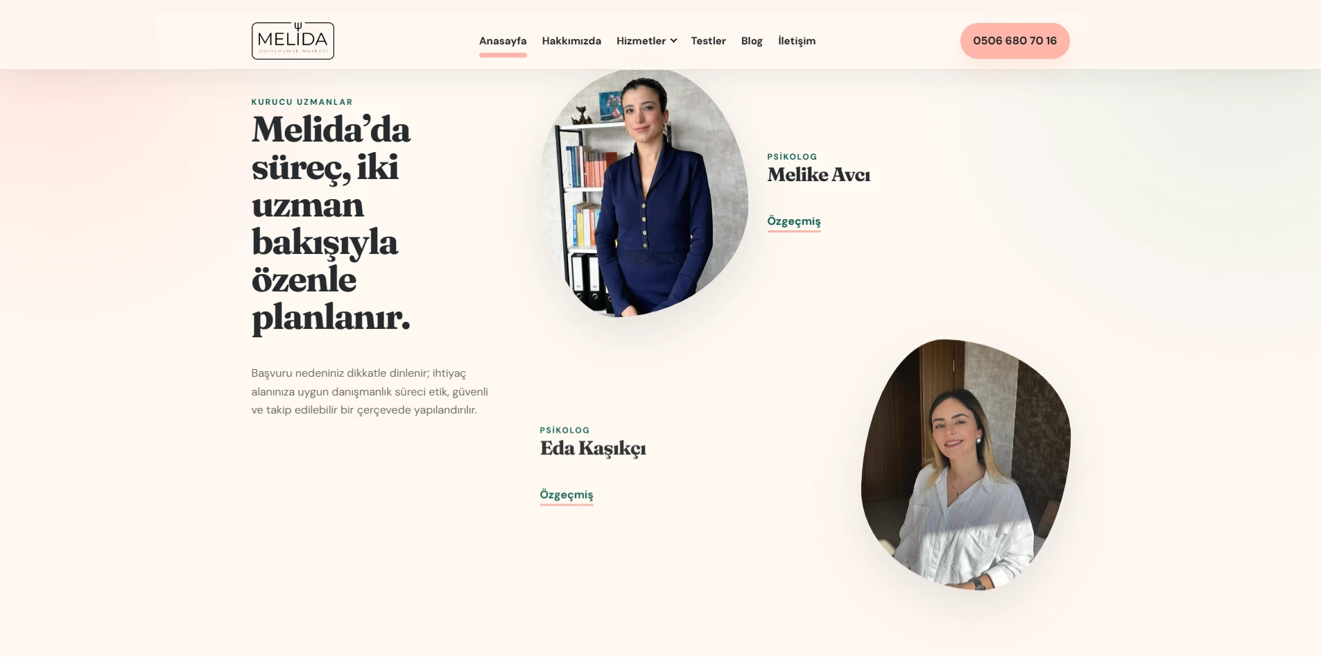
We made room to meet the specialists.
We placed the founding specialists’ photographs and biography links after the service information, helping visitors get to know the team before requesting an appointment.
We connected contact to the next step.
We brought service selection and a short note together in the appointment form. The details are prepared as a WhatsApp message so visitors can continue the conversation there.
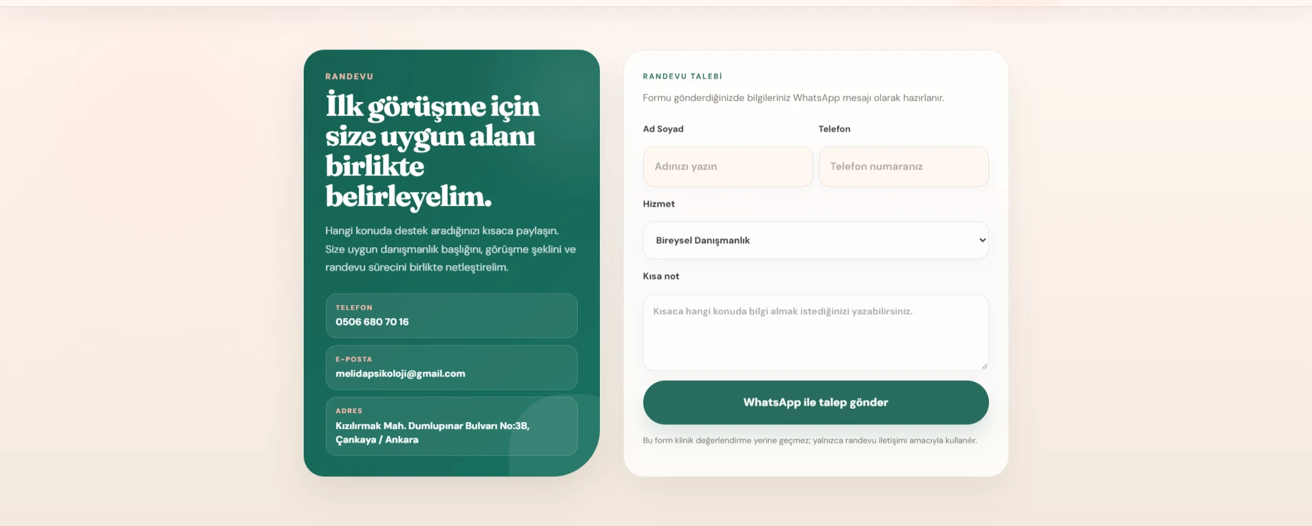
An interface that fits the brand.
We combined cream, green and soft pink tones with readable content and organic photograph shapes.
Consistent on mobile too.
We arranged the menu, service links and appointment options to remain accessible on small screens.
Connected pages.
We added links that guide visitors between services, specialist profiles, the blog and contact sections.
Let’s bring your brand’s voice
to the web.
Let’s talk about a website that clearly presents your work and makes it easy for customers to reach you.
Let’s talk about your project